Design
This is the phase of app creation process wherein the initial visual design setup of the app is configured for elements like themes, images, home screen layout, etc. The design phase consists of 3 sub-levels: Themes, Images, Layout.

Themes
We provide the user with a collection of mobile themes from which they can create their app design. The user may either use a design from the theme collection or create their own by uploading their own image set.
While editing, the user will see a ‘Your Theme’ option, which will present the image collection used to create the app. If the user selects a different theme, then they will be prompted with a confirmation message to reset the previous theme, thus losing all the previously saved changes.
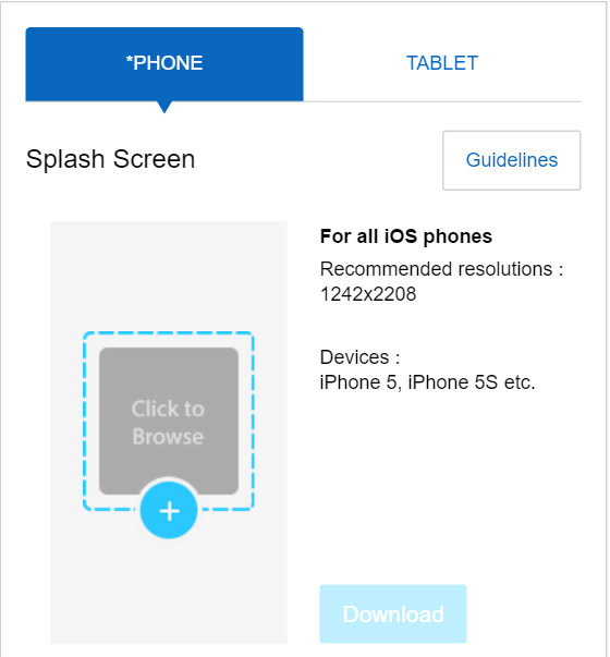
Images
This step creates a custom theme or modifies the existing theme. The user is provided with an option to upload or replace the existing images with 6 key components to create a customized mobile app image design.
- Splash Screen: The first screen a user sees when they open an app. This screen is displayed to the user while the app is loading
- Home Screen: This is a screen presented to the user once the app is loaded completely. This is the first app screen presented for the user to navigate to different sections of the apps
- Inner Screen: The app screens presented to the user when navigating from the home screen
- Logo: The logo of your app, which serves to express your brand
- App Icon: The App icon is presented on the phone’s home screen along with the App name. It’s also used in the MAD-store as an icon to identify and access a previously-viewed app
- Side Drawer: The Side Drawer slides in from the left and contains the navigation “shortcuts” for selected screens
Download Images
Replace the uploaded image
Related Articles
Edit App Design
When a user visits the Edit Design screen, by default, they will be presented with the Themes page which will list the themes available from the system and show “My Theme” . ‘My Theme’ is a collection of images based on which the app is being ...Get started with MAD-learn
MAD-learn is a one of a kind product which engages students in design thinking via Mobile application development process. It's a combination of project-based learning, research skills development, problem, technical training, and lessons in ...New App creation process
MAD-learn is a platform which helps students and teachers to learn about Mobile Application development. Our platform helps students, teachers, and other school staff to create new or edit existing mobile apps and learn mobile application development ...Side Drawer
The side drawer, also known as the navigation drawer or side menu, slides from the left and contains the navigation destinations for the apps. It is similar to the home screen which helps the user to navigate to the inner screens of the apps. ...Layout
The mobile app home screen consists of the navigation buttons for different screens within the app. The arrangement of these navigation buttons can be selected from the ‘Layout’ screen. We provide 4 different home screen button layouts: Listings ...